


If you’ve ever booked a family photo session or a brand photoshoot with your team, you’ve probably heard the advice: “Coordinate your outfits!” But what does that actually mean?
The word coordinate often gets mixed up with match — but the two are very different. Let’s break it down so you can feel confident styling your next photo session, whether it’s a cozy family shoot in the park or a polished team session for your business.
Coordination vs. Matching: What’s the Difference?
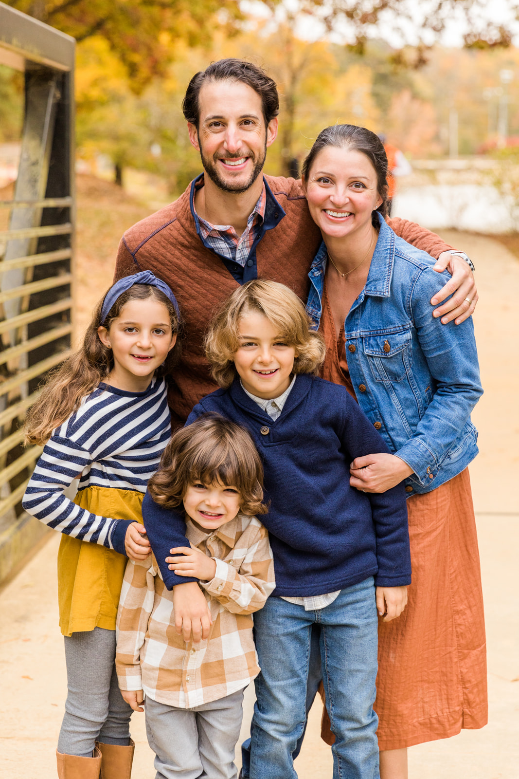
Coordinating outfits means selecting clothes that look good together, complement each other, and create a unified look — without everyone wearing identical outfits.
For example:
- In a family session, coordinating might look like choosing a color palette (like soft blues, whites, and beige) and allowing each family member to choose their own style within that palette. Mom could wear a flowy white dress, Dad a light blue button-down with khaki pants, and the kids in various shades of blue and beige.
- In a brand session for a team, coordinating might mean everyone wears business-casual outfits in the same tone family — for example, neutrals like navy, gray, and white — while still allowing personal touches like a scarf, jewelry, or a blazer with a subtle pattern.
Why Coordination Matters
Photos are all about visual harmony. When outfits clash, your eye gets distracted. When colors and styles are thoughtfully coordinated, the focus stays on what matters: your family’s connection or your team’s professional vibe.
In team photos especially, coordination helps you appear polished and cohesive — which is essential for brand consistency on your website, social media, and marketing materials.
Choosing a Color Palette
One of the easiest ways to coordinate is to start with a color palette. Choose 2–3 base colors and 1–2 accent colors.
For families:
A fall session might use burnt orange, olive green, cream, and denim. A spring shoot might lean into blush, soft gray, and white.
For business teams:
Consider your brand’s colors, your website vibe, the clients you want to attract and the environment of the photos. If your office has light, neutral décor, stick to crisp whites, grays, navy, or pastels. If your brand is bold and modern, lean into stronger colors like black, deep blue, or jewel tones.
Mix Textures, Patterns, and Styles
Coordinating doesn’t mean you all have to wear plain, solid colors. Mixing textures is a wonderful idea (think knits, linen, cotton, leather) and subtle patterns can add depth to your photos while keeping the look cohesive.
Examples:
- A family might pair a dad’s simple plaid shirt with mom’s cozy knit sweater and a child’s denim jacket.
- A business team might pair one team member’s solid blazer with another’s thinly striped button-down and a third’s classic dress.
What to Avoid
- Everyone in the exact same color (unless you’re going for a very specific, uniform look — which is rare outside of a formal headshot session).
- Loud, clashing patterns that draw attention away from faces.
- Logos and text-heavy clothing (they can date your photos and distract from the people in them).
The Goal: Consistency, Not Uniformity
Whether it’s a family or a team, the goal is to look like you belong together — not like you’re wearing the same outfit from head to toe. Think of your group like a great interior design project: individual pieces that work beautifully together in the same room.
So the next time you’re planning a photo session, don’t stress about “matching” — coordinate outfits for your photo session!
And the good news? You don’t have to figure it all out alone.
I’m always here to help guide you through the planning process — and I send all my clients a detailed session guide tailored to their specific type of photoshoot, whether it’s a family session, senior session, or a brand session. My goal is to make sure you feel prepared, confident, and excited for your photos!
Laure is an Atlanta based brand, family and senior photographer.


LEAVE A COMMENT
0 Comments